
A few weeks ago, a colleague from Telecom – Bretagne told me about an MIT project called Immersion, which is an impressive project for managing your GMail, Yahoo! and Exchange email accounts using a visual, graph based, approach. Here is a demo.
While I was looking the Immersion Web site I remembered my work when I was doing my Master of Sciences in Computer Sciences back in 2005 at the National University of Colombia (IMHO the best in Colombia BTW). My MSc thesis was entitled: “System for identifying, extracting and visualizing knowledge from emails”, however (and sadly) I wrote it in Spanish making its diffusion really limited. Anyway, here is a link to the final document.
Please, keep in mind that I am not trying to compare both projects nor I am implying something about the work of any person. This post is intended as a mere remembering exercise, and yeah, for me to present my MSc thesis in a more relaxed environment.
The general idea
In 2005, by the end of my BS I started working with social networks in a TELCO in Bogotá, and then I discovered a vast world of possibilities and uses. At that time, for me those things were just graphs and data structures… I was young and naive. We were then analyzing corporate email communications and taking those communications with certain key words that happened to be important for the company. But I will make a whole post just for that project.
While I was working on that I came up with the idea of that analyzing the body of the email it could me possible to extract more knowledge and then have better (?) results, or at least more elements for extracting conclusions. My boss said ‘no way, we do not have the time nor the experience to do that’. I left his office thinking ‘well, what a shame’.
At that time I started my MSc and I had to present an idea for a research thesis by the end of 2005. Thus I started to gather documentation about social networks, emails and text mining. Then with this initial idea on mind I looked for the professor that I knew could be interested, and indeed, he was.
We discussed about the elements I already had, and by the end of the conversation he told me ‘what if we create a visualization scheme based on all the information gathered from the messages, including the social network?’. Visualization was not my thing, but, why not? Managing emails was (and it is today) a tough task, it is a challenge. So, we started to work on.
The model
Is pretty simple, we wanted a visualization model for presenting at the same time, on the same visual plane, information from the topics in the messages and the social network of the owner of the messages. Here is the general architecture of the model:
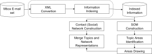
General architecture
The social network was easy to extract (I had done that before) and it is, as you can imagine, generated using the from, to and cc fields from the email. The other part, the topic extraction was more difficult to achieve.
Extracting topics from emails involves the analysis of natural language, written in different ways, sometimes with typos or with a lost of acronyms. Trying to overcome most of those problems, we selected a well known email corpora, written only in English and for which the owner of each account was well defined: the Enron data set.
The pre-processing step involved some cleaning: punctuation signs and stop words removal and stemming. Next, each document (email) was transformed into a vector to extract features. This extraction was made using Term Frequency (TF) and then, for determining the relevance of a particular term in a document I used Term Frequency Inverse Document (TFIDF). I used a SOM to cluster the emails, represented now as terms vectors. The SOM find a set of groups which are not the final groups… one need an additional step.
To cluster the areas of the SOM we used a (agglomerative) hierarchical clustering with a cosine distance as similarity measure. Using this I was able to produce maps with displaying the topics as areas. How many? well, it depends on the cut on the dendrogram:
 20 topics |
 15 topics |
 10 topics |
 5 topics |
Figures above represent different clustering configurations for the same data set. Each are represent a topic within the messages. To obtain the ‘best’ configuration I used the ‘silhouette coefficient‘ and for this data set I obtained this:

Best partition: 4 topics
which is a partition of 4 topics. Each topic (area) is described using a list of representative words. To set the size and the color of the areas, I used the following similarity measure:

where Ci is the center of mass of the ith area (topic), p is the pixel being drawn and σ2 is the size of the area, given by:

The last step is to show the network with the topics. For this, I developed a simple method which is based on the forces that a node may experiment if each area exerts a force over it. Imagine the map to be a force field where the force of each topic is proportional to the distance to its center of mass.

Force field
The ‘distance’ of each node to the centers of mass is calculated according to the number of emails sent and received by the person represented by the node in each area. Thus, it is possible to say that the location of each nod describes its affiliation with a set of topics.

Topics and nodes
Figure above shows the final result of the model. The owner of the network is near the Area 0, in color cyan. Red nodes are nodes connected at 1 hop from the owner, yellow ones 2 hops and greenish 3 hops. Despite the representation is not the best (given the actual technologies and models) it is still a good representation of what is happening on the emails and helps to know about what each actor is talking.
To conclude…
Well, this was a pure academic work with no intention of becoming a real email managing system or tool (I wanted to transform it into a plugin for Thunderbird or something, but then I became a consultant and my time was not mine anymore…) however it allowed me to know some awesome people like Cécile Bothorel and Bernie Hogan at the SUNBELT conference in 2007.
Maybe I will revisit this project and rewrite the whole thing (it was written in Java and was intended to be an offline tool) and make it accessible, it may be useful for other people.
If you have had the courage to red up to this line, thank you for reading, and if you have any comment or question or remark, I will be glad to answer.
